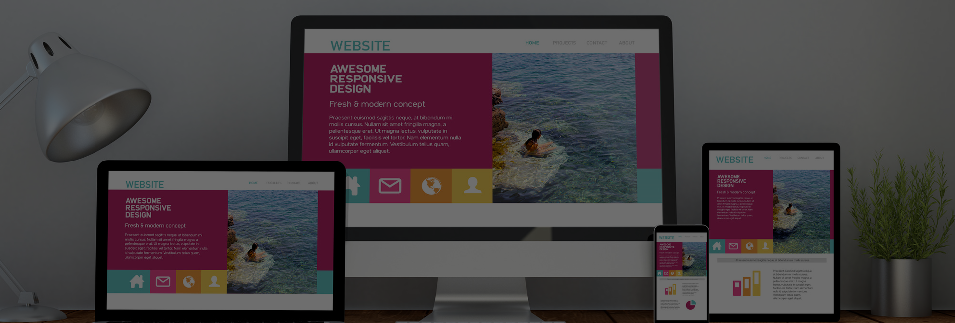
Designing a website can be a complex process, and there are many factors to consider to ensure that your website is effective and user-friendly. It’s important to avoid common pitfalls that can make your website difficult to use or that may discourage users from spending time on it. In this article, we’ll discuss some things to avoid when designing a website, including the overuse of fonts and font sizes, poor color schemes, too many graphics, and images, the use of Flash, pop-ups and auto-playing media, small or difficult-to-read text, jargon and technical language, and the importance of testing your website on different devices and browsers. So to know, about more new features and things about designing must refer or contact those web designers that provides the best web design in Calgary to know more in detail about what to keep in mind.
By following these tips, you can create a website that is professional, easy to use and engaging for all users.
8 Things To Keep In Mind When Designing A Website
Overuse of fonts and font sizes
It’s important to choose a font that is easy to read and looks good on all devices. Using too many different fonts or font sizes can make your website look cluttered and unprofessional. Stick to one or two fonts at most, and use headings and subheadings to break up text and make it easier to scan.
Poor color scheme
Choosing a color scheme that is difficult to read or that clashes can make your website look unprofessional and discourage users from spending time on it. Stick to a simple color scheme that is easy on the eyes and complements the content of your website.
Too many graphics and images
While graphics and images can add visual interest to your website, using too many of them can make your website slow to load and difficult to navigate. Use images and graphics sparingly, and optimize them for the web to ensure that they load quickly.
Use of Flash
Flash is a technology that is not supported on many devices, including most mobile devices. Avoid using Flash on your website to ensure that all users can access your content.
Pop-ups and auto-playing media
Pop-ups and auto-playing audio or video can be annoying to users and may cause them to leave your website. Avoid using these features to create a more positive user experience.
Small or difficult-to-read text
Text that is too small or that is difficult to read can make your website difficult to use and may discourage users from spending time on it. Use clear, easy-to-read font sizes and ensure that your text has sufficient contrast with the background color.
Jargon and technical language
Avoid using jargon or technical language that may be confusing to users. Use clear and concise language that is easy for all users to understand and designers can easily produce the best web design in Calgary.
Testing
It’s important to test your website on different devices and browsers to ensure that it is accessible and looks good on all platforms. Make sure to test your website on various devices, including desktop computers, laptops, tablets, and smartphones, as well as different browsers such as Chrome, Firefox, and Safari. This will help you identify any issues and ensure that all users have a good experience on your website.
Summary – What To Keep In Mind When Designing A Website
When designing a website, it’s important to avoid certain pitfalls that can make the site difficult to use or unattractive to visitors. These include using too many fonts or font sizes, a poor color scheme, excessive graphics and images, Flash, pop-ups and auto-playing media, small or difficult-to-read text, jargon and technical language, and not testing the site on a variety of devices and browsers. By following best practices and avoiding these mistakes, the designers that make the web designs in Calgary can create a professional, user-friendly website with the help of developers that engages and retains visitors.


